COMMUTER CONNECT
Project Date: 8 week design
Location: Kennesaw State University
Commuter Connect is a mobile app designed to improve the commuting experience for college students by integrating parking updates, event notifications, and study-group coordination.
My role: Team Lead & UX Designer
Team size: 4 members — UX researchers, designers, and content strategists”
Tools used: Figma, FigJam, Microsoft Forms, Miro, etc.
Duration: (8 weeks, Spring 2025)

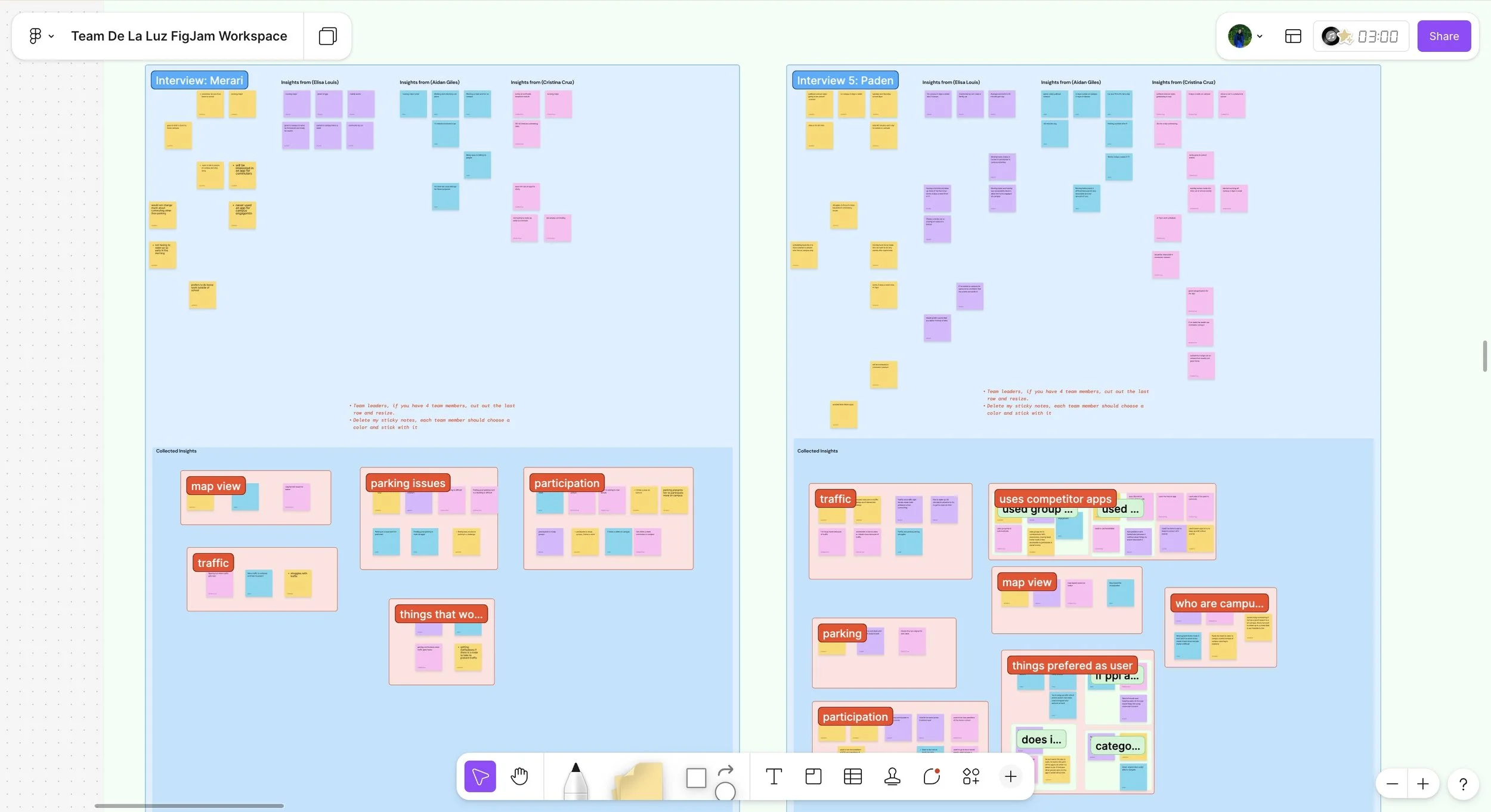
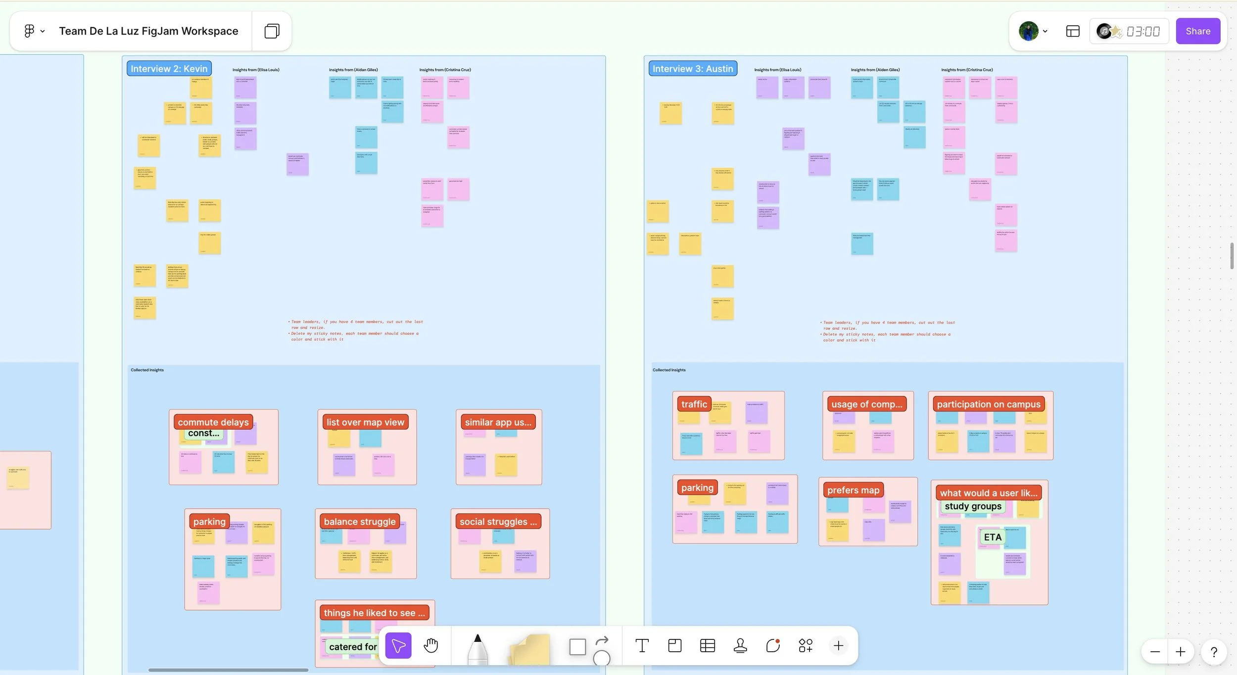
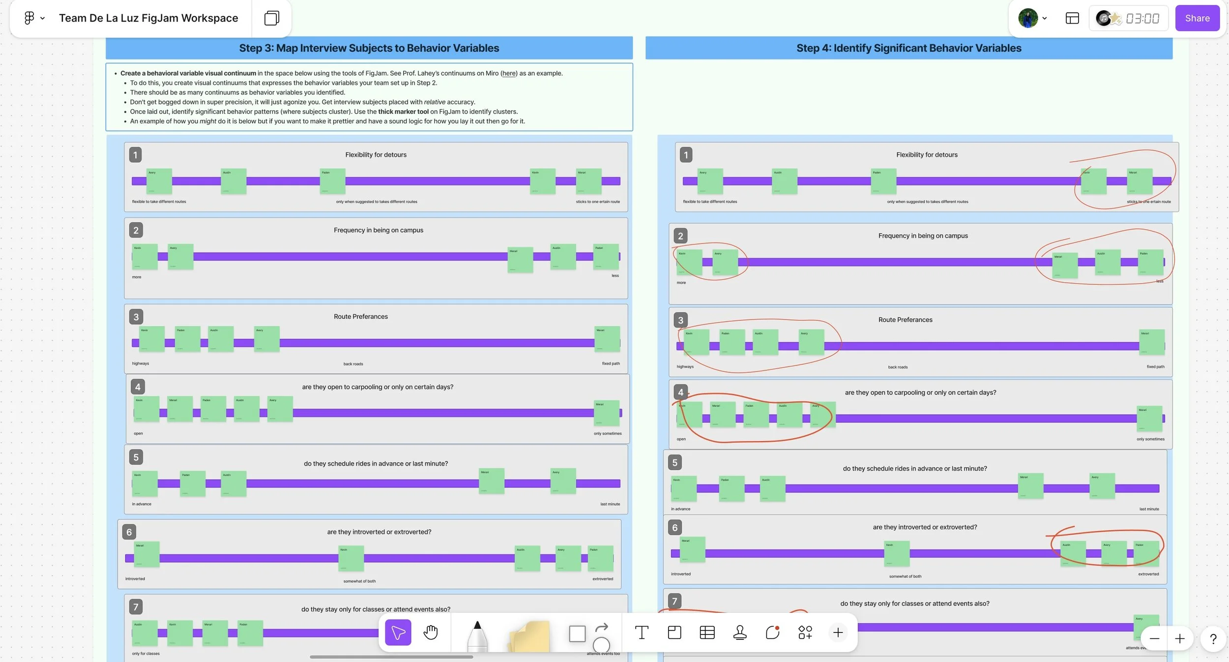
We synthesized feedback from 5 commuter students and identified three key frustration themes: unpredictable parking, lack of connection, and poor time awareness.
We categorized insights from student interviews into themes, which revealed that parking convenience and social connection were key motivators.
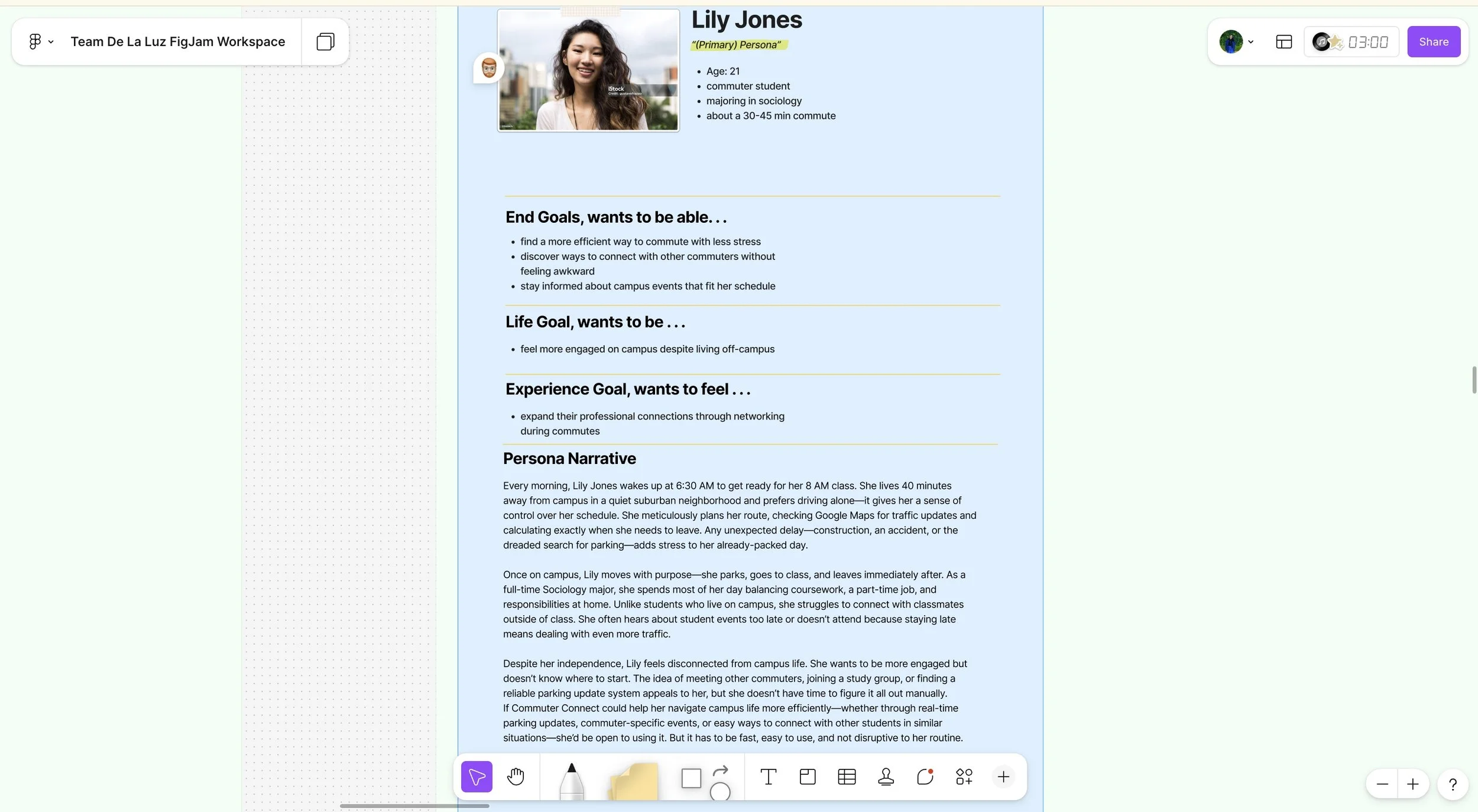
Based on our findings when talking to our interviewee’s we created our primary persona, Lily Jones, a 21 year-old commuter who wants to maximize her limited time on campus while staying connected to events.”
Using FigJam, we mapped interview participants across behavioral variables to uncover patterns in commuting habits. These clusters informed our primary personas and validated which user goals—such as efficient parking and connection opportunities—were most significant for design decisions.
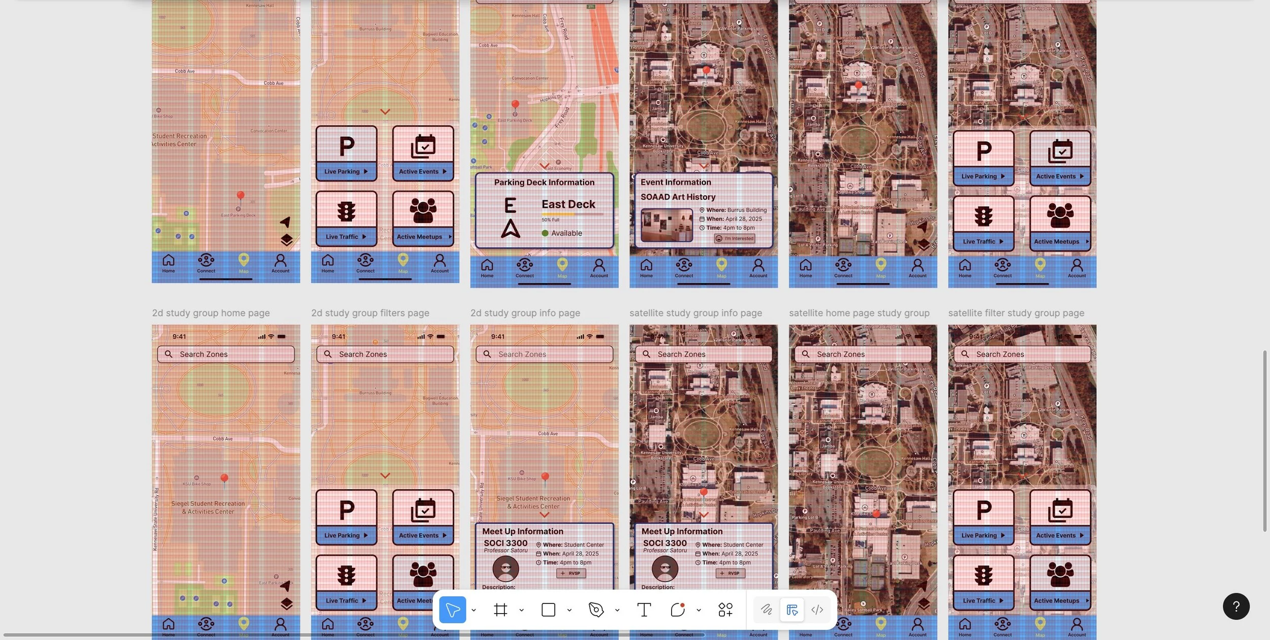
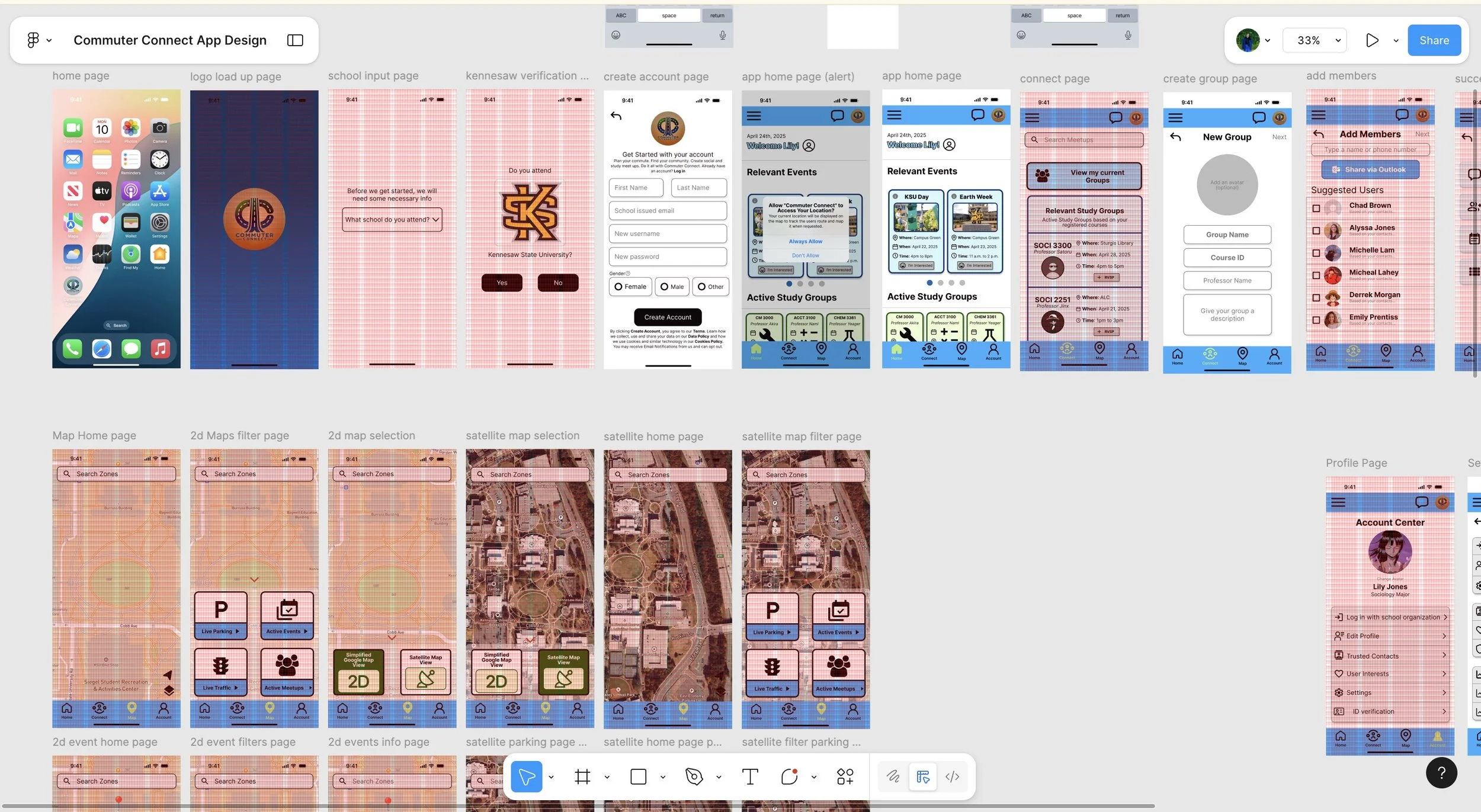
Commuter Connect improved task efficiency for student commuters and demonstrated the importance of goal-driven, collaborative design. This project strengthened my leadership and reinforced my ability to translate user goals into functional, user-centered interfaces. My team and I created 47 frames to really bring commuter connect to life.
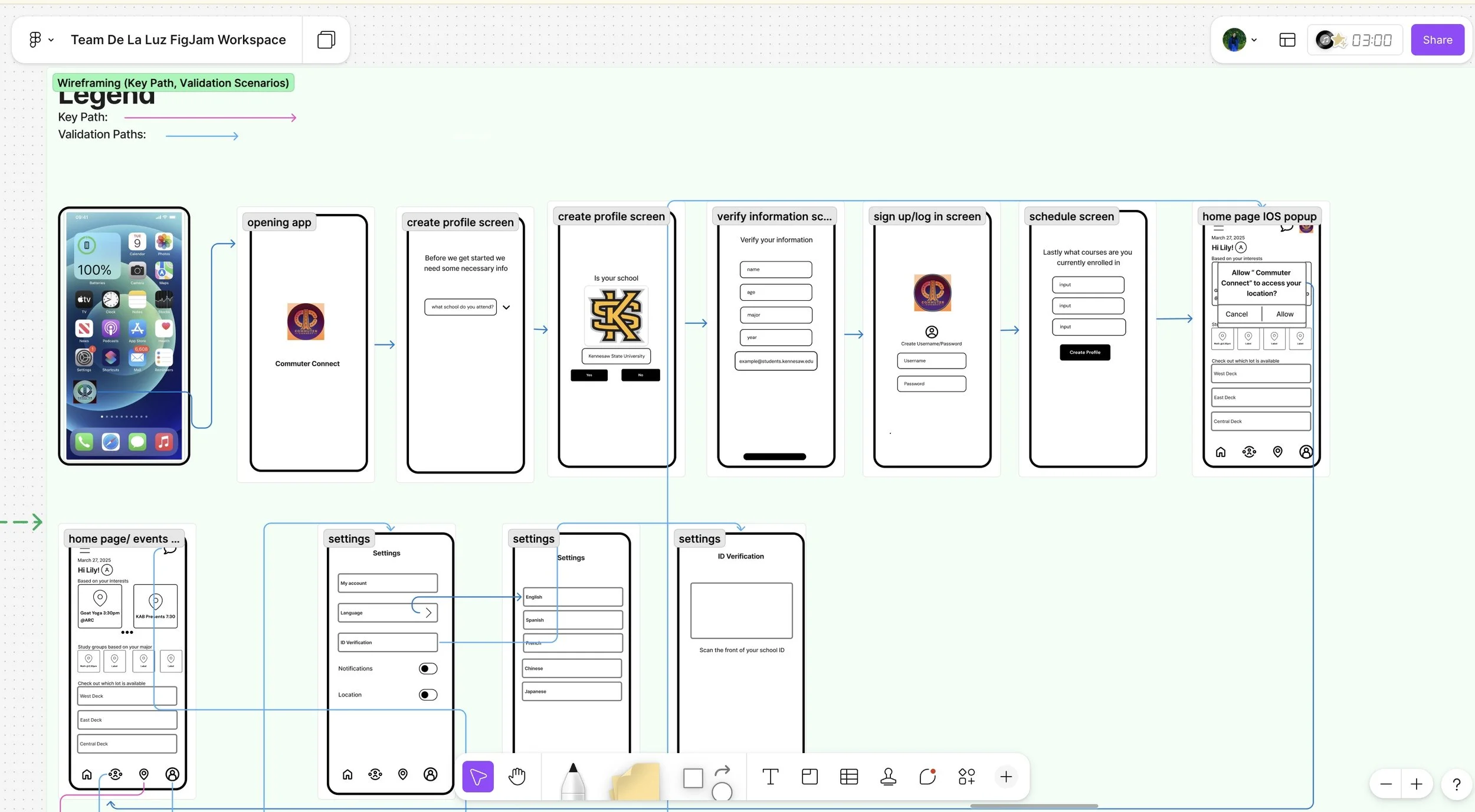
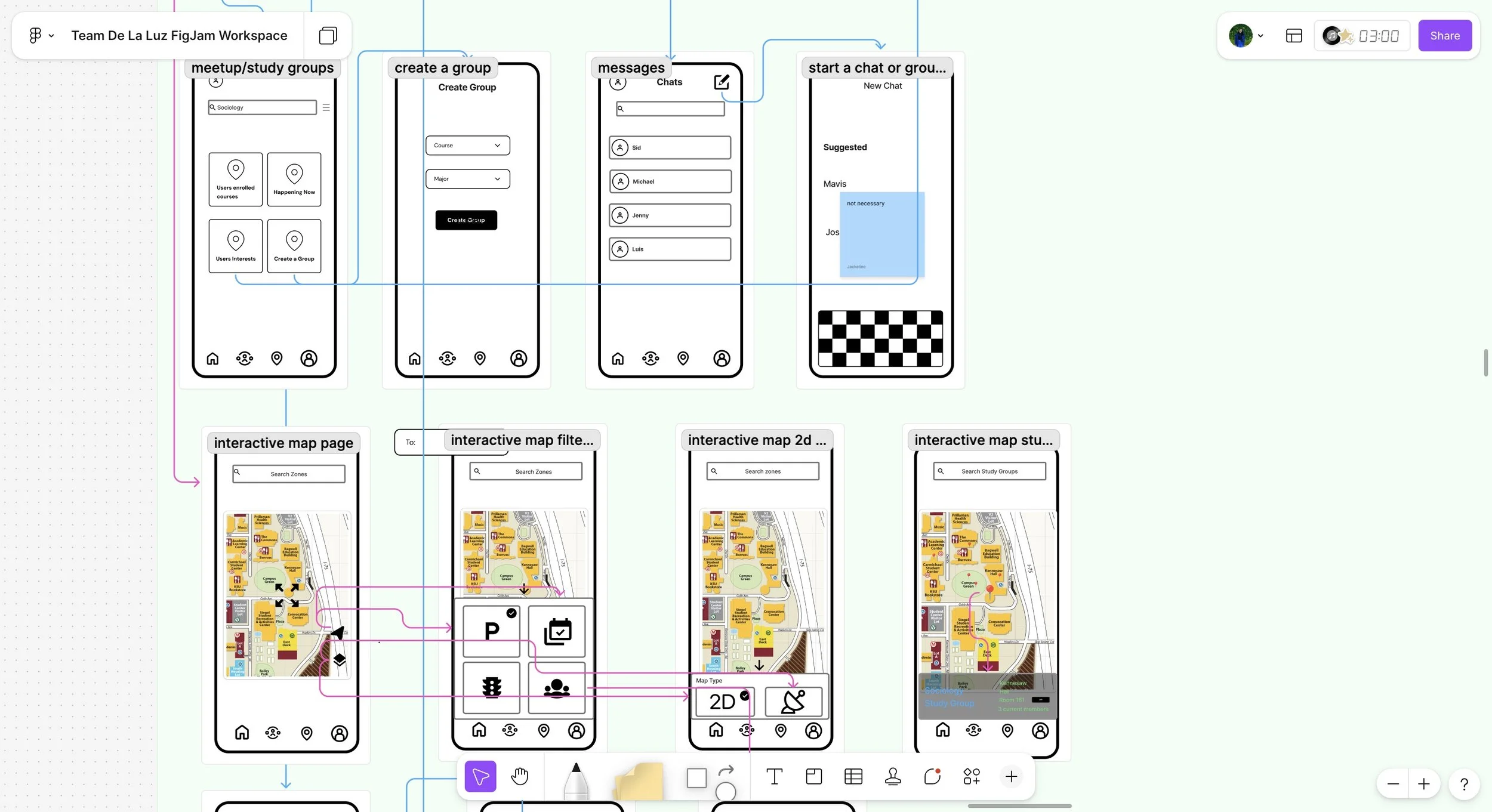
Our low-fidelity wireframes focused on mapping the core structure of the app before visual design. Each screen explored how commuters could quickly access parking information, browse campus events, and connect with peers — all within two to three taps.
Early wireframes translated user goals into simple layouts that prioritized clarity and quick navigation. These helped us test usability concepts before refining our design system.